UI Overhaul [Update Pt 1/3]
It’s been crazy long since my last update, sorry about that. I did post back then that my Internet troubles were solved though, I woke up the next morning to notice that such was not the case hehe.
But anyways, I don’t need the Internet to develop LBKR, fortunately– it’s difficult to share the progress though but better late than never!
Due to the amount of changes and updates made to the game during my offline time I’ve decided to split the dev. report into “smaller” articles on more specific game elements to (hopefully) not drown you readers in an ocean of text, in this article I’ll go through the updated User Interface.
UI Overhaul – Redesign
Many elements of the LBKR UI felt really clumsy to me atleast so I did want to update it for the coming release of LBKR, I did not expect to do as many changes as I did in the end but I think the result was descent enough!
The GameJolt login panel, seen in the first page of the Main Menu now start minimized, I saw no reason to have it take up half the screen by default as it is not mandatory to sign in to game jolt in order to play the game.
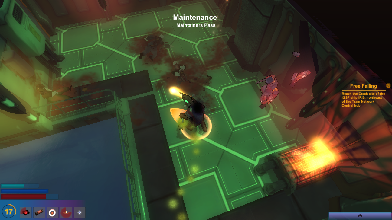
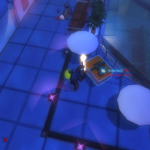
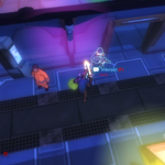
On to the heads up display, as can be seen in the following screenshots in this article the quickbar at the lower right of the screen has been replaced with a pop-up menu, the functionality is the same as in previous versions but it’s a little bit neater, also the experience bar in the middle of the screen has been scrapped and replaced by the small orange wheel at the lower left quickbar.
Furthermore the name of the current map and map/section-location (ie dungeon level) can no longer be seen in the uper right corner of the screen. The location name can still be seen by opening the Game Menu (Esc), it’s also printed each time you enter a new map but that text will fade out after a few seconds.
The new fading text object is also used in order to reveal the area name each time you locate a hidden room.
The new fading text object is also used in order to reveal the area name each time you locate a hidden room.
I think these changes has helped to keep the screen less jittered with various texts, images and what-not and provides a more clean layout.
I’ve also increased the size of the dialogue pop-up windows in order to provide a more easy-to-read text area.
UI feedback for new game mode
I can’t remember if I’ve posted here about the upcoming game mode, I’m sure I have done it on twitter though. But in any case, a “Hardcore” game mode will be implemented, ie. if your character dies, it stays dead.
While playing in this game mode the game track combat and world statistics and certain events in-game that in the end, result in a score value for a hardcore-character scoreboard.
The scoreboard can be accessed from the Main Menu button “Badass History”, while the scoreboard currently only store local character scores I plan on having the scores uploaded for online-comparison and such later on.
The death screen also has another appearance while playing in hardcore mode, instead of respawn-choices the game will print a summary of your character’s stats and actions throughout the game and calculate a score based on those.
UI Tooltips
I’ve added multiple tooltips to various UI/gameplay elements, in order to give better feedback to the player on how things in the game work. As an example, the “Increase Tier” and “Equip Ability” buttons in the Ability window have received such tooltips, explaining what the buttons does and also how equiping an ability works.
Log Window
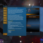
The Log/Journal window has been changes alot, first of all, the main window takes up less space on screen and only display the log list(s) and world and mission updates.
When opening a log to read a new window will pop up on screen with the log data printed.
Do note that in the log list, logs that have not yet been read are now flagged “Unread”. Also each log type now use it’s own icon. ( There are 4 types of logs, Com Signal (Radio transmissions), Personal Logs/Notes, E-mails, Beastiery entries. )
All beastiery entries have received two new fields, “Common Locations” that reveal in what maps you are most likely to encounter the monster, comes in handy when trying to complete certain Bounty Contracts, and “Combat Notes”. The Combat Notes field reveal some combat statistics, behaviour or other tips regarding the monster’s weakness or powers.
Ability UI
Looking at the ability window, the amount of free ability points that you can currently spend on upgrading your abilities is now printed at the lower center of the ability window.
Furthermore all ability tooltips have been re-written and now also use rich-text in order to mark down key parts of the tooltip with colored text.
Inventory & Item UI
Some major changes has been done to the item tooltips, each item property has received a specific icon to help quickly identify the property type, the background of the item tooltip windows are now less opaque and weapon tooltips now reveal the weapon’s “Armor Piercing” rating.
Tooltips for mission-specific items now display “Mission Item” as title instead of “Quest Item” as it did earlier.
In the inventory window you can see that some rearrangements has been done to the “Selected Item” panel, it display a default item tooltip to the far left, with the item’s properties revealed.
Hints / Indicators
I’ve changed the style of the interaction hint, making it more apparent, it’s also animated now, giving a smooth look when poping up on screen.
Depending on what you can interact with the icon at the center of the interaction hint will change, if you can speak to an NPC a speech-bubble will appear, if you can open a door or loot the old “Pointing-hand” icon appears, etc.
The map-name/area-location text that appear at the start of each map is now animated and the experience/level meter will play an animation aswell when you level up.
I’ve also fixed an issue with the game logics that prevented the mission indicator/tracker to load the last tracked mission when a new map was started.
Mission / Bounty Window
I’ve reduced the transparency of the bounty overview window that pops up when you click on a bounty contract, also the “Bounty Reputation” and “Bounty Mark” fields/icons have been rigged with tooltips to explain their purpose for the player.
I’ve moved the Bounty Contracts panel beneath the mission window as the window would go off-screen if the player were running the game in a screen ratio of 5:4 or 4:3
Also all contract-controls (Abandon Bounty/Turn in Bounty) have been moved to the contract pop-up window.
That’s it for this time, I’ll return real soon with a progress update regarding the five new chapters of LBKR!





Leave a Reply